Say Hello To Our New Look
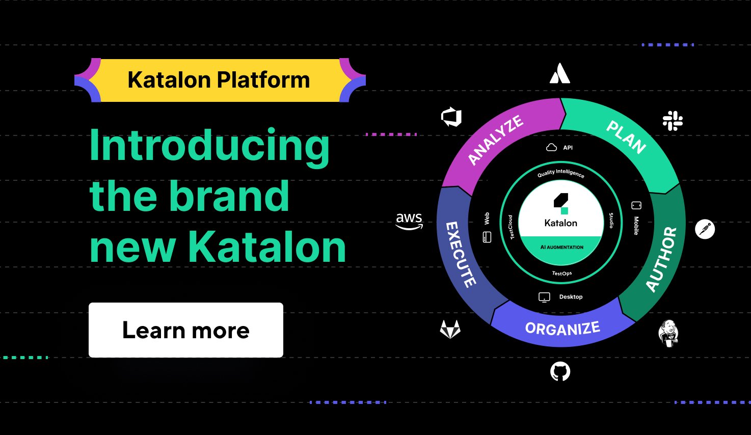
Today, we're launching the Katalon Platform - a modern, comprehensive quality management platform. Going along with this product transformation is the global brand elevation. At the heart of the brand elevation is an update of Katalon's vision, mission, and values - matching the strategic vision - and an update to the corporate logo, color, font & illustration.
We wanted an identity as revolutionary as our product.
With the next phase of our journey mapped out - Katalon Platform and our goal to reach millions of users who want a modern, comprehensive quality management platform, we decided to make a bold move - taking a global brand transformation. We wanted an identity as revolutionary as our product so we could effectively reflect on what happened and where Katalon is going.
To embark on this journey, we partnered with Skona, a creative agency building brave B2B tech brands in Silicon Valley and across the globe, aiming at evolving, elevating, and solidifying the Katalon brand for scale. Besides developing and experiencing a new visual identity coming to life, the brand elevation effort also allowed us to look at the market landscape and users' expectations; think about what values we deliver, and what makes us different.
Katalon brand elevation is not cosmetic; it reflects our platform transformation.
"Our mission is to empower teams of all sizes to deliver exceptional digital experiences faster. Our vision is being admired as the leading innovator in software quality and has inspired countless companies to make quality the essential catalyst for growth," says Vu Lam, Katalon Founder & CEO. “The new logo, color, and illustration reflect the story and passion for our work. Also, it marks a transformation inside Katalon and out," He added.
The whole concept of the new brand was based on 3 personality traits:
- Sincere: We're open, transparent, and dedicated to our customers, employees, and the global software community. We earn trust through consistent actions and advocacy.
- Practical: We're focused on doing what we do well. No fluff and no workarounds. We make testing smart, efficient, and simple for everyone.
- Innovative: We will never stop looking for new ways to make the world of software quality easier, better, and faster. Our customers and community fuel the evolution of our platform.
This new brand represents what users feel when they access Katalon channels: Clean, Accessible, and Dynamic - on top of that, reflecting the story and passion for our work.
Working with the creative team at Skona, we explored a wide range of possibilities for the new identity. Ultimately, the team decided to inherit the symbol "K," retooling it and updating it with a modern look to eliminate reproduction challenges and increase consistency across applications.
- The new Katalon logo comprises 02 basic geometric shapes representing a starting point and the act of beginning. The block in Bright Green signifies "Go" from a testing perspective, with the graphic mark in Stable Black representing the constant movement and flow within the testing process. Also, when going together, it looks like an abstract K, signaling the origin of Katalon - incubated by KMS Technology in 2015.
- Katalon's primary graphic elements are the Pathway graphics, which convey the innate process and movement experienced through testing. The Pathway graphics is a visual representation of the simple, thoughtfully-designed Katalon Platform, which delivers an easy and effective testing solution for all teams.
See how our brand identity comes to life
The new branding has been rolled out across the globe. Visit our website katalon.com to see how our new brand identity comes to life.
Also, today, we're launching the Katalon Platform. Read this blog post to see how we've built up to this, what's in the platform, and what's on the horizon.


